
Key Concepts Study Tool: Chapter 03
Click on each concept below to check your understanding.
1. Frequency Table
- Tells us the number of times an item or response category comes up in a sample.
- Cumulative frequency: Running total of the frequency of observations in each category.
- Cumulative percentage: Total of the percentage of observations in each category.
- Some equations that may come in handy:

2. Bar Charts
- An alternative to frequency tables.
- x-axis: The response categories should always appear here.
- y-axis: The frequencies should always be here.
- Axis titles should be brief and non-repetitive, used to describe the data on the x- and y-axis
- Axis scales are the values that appear along the x-and y-axis of any plot, the numbers should be listed in equal increments and as efficiently as possible (e.g., 0, 2, 4, 6, 8, not 0, 2, 4, 200, 1000).
- Legend: A box that describes the contents of a graph or chart.
3. Ratio
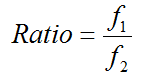
- A stated relationship between two quantities. A ratio represents the number of observations in one category compared to the number of observations in another category.
- Can be used to compare categorical and continuous data.
4. Rate
- A rate is a special kind of ratio of two measurements with different units, but usually with an intuitive denominator (e.g., kilometres per hour, cents per kilogram).
- Usually used to compare continuous data.
- Most common method for presenting univariate data in social sciences (e.g., fertility rates).
5. Percentiles
- Determined by slicing a sample into 100 groups, making sure that each group has exactly the same number of people.
- Deciles: (10, 20, . . .)
- Quartiles: (25, 50, 75, and 100)
- The 50th percentile is equivalent to the median, with exactly half of the sample falling below and half above this value.